Hanukkah treats

I like it when Hanukkah doesn't overlap Christmas, I can keep the two celebrations separate.  I am Jewish, and my husband is Catholic, so we have extra holidays in our house.

My sister and I spent some time this past weekend coloring, and made these little gift baskets.

The pink one is from a design on Splitcoast.  I made it first, but when my 22yo son Gordon saw it, he didn't like it at all;  he wanted a more open design that holds more treats.  He then came up with the folds for the blue basket.  The pink one was colored with the Penciled Twinks technique (it has a really nice shimmer); the blue one, colored by my sister, used Tombow markers and a blender pen.

Notice, if you will, the staple details on the corners.  I did those with my new Tim Holtz Tiny Attacher.  I love it.  The staples are so cute!

Anyway, I did another project for Hanukkah - this candle box.

It looks so much better than the ugly boxes that the candles come in!  This is nice enough to leave sitting out.
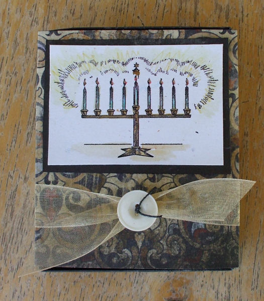
I picked up the directions for this box from Ellen Hutson, the papers are Kahmalaht from TAC, and all the Hanukkah images are free from Digital Two for Tuesday.  There is glitter pen on the flames and highlighting the metal, for extra sparkle.

Of course there are challenges:
Cupcake Craft - light it up
Karber Weekly - digi and sparkle
I Did It Creations - surprise (were you expecting Hanukkah projects?)
Paper Sundaes - fancy corners
2 Sisters - not traditional Christmas (ha ha!)
Bee Crafty - something hidden
Marks Finest - bows
Sweet Stampin - buttons and bows
Fairy Fun - buttons and bows
Mami Doodles - gift item
Wags and Whiskers - wrap it up
Moving Along with the Times - multiple folds
StampInsanity - try something new
Cheerful Stamp Pad - deck the halls

Thanks for looking!

Juliet Arrighi

Transgender Day of Rembrance

I had an interesting conversation with my 14yo son this morning. He asked me to cook him some breakfast, and as I was chatting with him, I noticed from across the room that he was wearing a small button on his shirt. This is an unusual thing for Ben.

Me: What's that button on your shirt?
Ben: Nothing, it's just a button.
Me: There is something on your button. What is it?
Ben: Why do you have to give me a hard time about everything?
Me: I just want to know why you are wearing a button.
Ben: I just am, okay?
Me: So what does it say?
Ben: It's LGBT.
Me: Okay. (pause)Because today is the day of remembrance?
Ben: What?
Me: The day of remembrance for the LGBT that have died.(well, just transgender, but at this point, I'm not really sure Ben even knows what LGBT means.)
Ben: I'm just wearing the button.
Me: Where did you get it?
Ben: I found it on the floor in my room.

This is the first thing that made any sense in this conversation, because I remember Sophie trying to start a Gay Awareness club in her high school (long story), and Ben took her room when she went off to college.  When I brought Ben is food, I got a better look at the button.  It had the HRC logo with "HRC.ORG" under it.  That's pretty subtle, I think - not every kid his age would know what that is.  Maybe Ben does know what LGBT means.

So, I made this card for the Transgender Day of Rememberance.
The butterflies and dragonflies represent spirits that are finally free from mortal suffering.  They are my favorite images for sympathy cards.

I was trying to duplicate a technique I saw Valita demonstrate on her site - it's harder than it looks, but I love the lacy effect.  The pink is a liner - it's hard to write words in a card that has holes in the front unless you put in a liner.  In real life it's a much softer pink.  All the shapes are punched - I used 4 different punches.

I had to enter the card in a few challenges, of course:
Crafty Emma - lace
Ellephantastic - butterfly
Alice in Wonderland - butterfly
Stamp Scrap Doodle - no flowers
Fairy tale - white

Remember, no hate!

Juliet Arrighi

Winter wishes

This card reminded me of one of the things I hate about coloring - matching papers to the image afterwards.  I only used two colors, but somehow the colors turned weird, and I had to use weirdly colored paper to make it work.  Also, I strongly feel that Christmas cards have to sparkle, so after I put it all together, my glitter pens got put to work.  I handwrote the sentiment with a glitter pen, too - I'm losing interest in stamped and printed sentiments.  My handwriting is legible, isn't it?  I had to stick an iridescent ribbon on there, too.

The image is from Ildi Co.  I won it back when they were doing challenges - they have a cute Christmas freebie on the site that I think is worth grabbing.  I don't know if they sell stamps any more - I can't find the store. 

Several challenges inspired the final look of the card:

Fairymoon Crafts - sketch
Crafty Calendar - winter + snowflakes
Crafty Pad - Christmas Sparkle
Paper Sundaes - punches, ribbon, blue
Mark's Finest - snowflake
Sweet Stampin - snowflakes


Juliet Arrighi

Stand-up Thanks

If you've been stamping for a while, you've probably seen this sort of stand-up card.  I think it is a very cool type of card, but I can tell you from experience that most people would not know how to set it up if they received it.  It mails completely flat, with most of the card hidden inside the box, and I've seen people fumble with it and never get it upright.  I would be hesitant to mail it to a non-stamper.

Anyway, the story behind this card is that I made it at a TAC hostess club meeting, and Chris, our demo, had both Bic Mark-its (my preferred alcohol marker) and Copic Ciaos set out to color the images.  This is the first time I had both in front of me, and I have to say, the Ciaos did handle better, and to make a long story shorter, I ended up buying a set.  By a set, I mean a Caboodle set - TAC sells Copics in Caboodle packs, which is 12 markers - 4 colors with three shades of each color for blending.  The Caboodle sets also have coordinating cardstock you can buy so that you can be 100% certain that your colored images will go with the card you are making, which eliminates most of my concerns with coloring in general and Copics in particular.  I would hate to spend a lot of money on markers and not have the right blending colors, and I hate coloring an image and finding out afterward that it doesn't match any of my papers.  TAC even has beautiful designer papers to match the Caboodle colors - it's really a great concept.

My last big concern with Copics is the cost, but since this was my month as hostess in our hostess club, I got my Copics at 40% off, so I should be good to go!   

There are a lot of challenges right now for thank you cards in autumn colors:

Craft Your Passion - doubles (the acorns)
Stamp Scrap Doodle - fall
Our Creative Corner - gratitude (I'm grateful for my friend Chris who showed me how to do this!)
Crafty Emma - autumn
Digi Doodle - autumn
Shirley's 2 Girls - thanks
Cheerful Stamp Pad - thanks
Tip Top Tuesday -  color with copics

Juliet Arrighi

Bear market rose

No, I'm not telling you that stock prices are going up, I'm telling you that my IRA is doing lousy.  I could tell it was doing lousy before I even opened the annual report, because of the cheap, flimsy paper.  When things are going well, your companies send reports on gorgeous, high quality paper, and when there are negative numbers on page two, the report is tiny, and printed on thin cheap paper.  This paper looked like dress pattern paper.

I will say that when I saw the Fun with ATC's challenge, money, I thought it was an impossible theme.  Then I saw Vicki's take on it, using chinese coins just like the ones I have, then I felt really stupid.  It was still bothering me when I saw the flimsy paper, so the sudden inspiration to use it for this ATC was inevitable.  It may be a stretch of the theme, but at my age, my retirement account balance matters!


This is one of those crumpled paper roses, made with about a dozen layers of punched scalloped circles.  There is a brad in the middle, but you can't see it.  Once I made the rose, I wasn't sure what to do with it, so I kept adding aspects from different challenges until I liked how the ATC looked. Some touches are subtle, like the little bit of fine glitter on the rose, or the clear embossing on the word, but I don't think this card would be half as nice without the inspiration each challenge provided.  Here is a list:

Fun with ATCs - money
AI Factory - garden
ABC - glitter
Cook it up with Katie - black/texture/swirls
Oldie but Goodie - old stamp, distressing
Doodle Palace - sketch
Eat Sleep Stamp - sketch (yeah, it was the the same sketch!  I took it to be a sign)


Juliet Arrighi

Self-challenged

Last week I went to a Christmas card workshop.  I liked the stamp set we were provided, and the paper set is one of my favorites, too, but the cards just did not move me.  I think it is because I like a lot of shimmer and shine on my Christmas cards, or at least bright colors, and these cards weren't really either of those things.  My challenge to myself today was to take the stamp set and the leftovers and make a card closer to my tastes.
There is shimmer all over this card, from the Laser Lustre paper and pearlescent embossing powder to the pink organdy ribbon and the mother of pearl button.  There would have been even more if I had Versamark Dazzle, but I just used regular Versamark for the swirls and corners on the background paper. The little tag is from the paper pack (Reese) which, like the stamps, are sold by The Angel Company.

In addition to my own personal challenge, this card fits a few others:
GingerSnap Creations - Versamark
Crafty Cardmakers - Stitching
Crazy Challenge - Pearls and swirls
Critter - Christmas
Little Paper Shop - Buttons and bows
Stamp with fun - Things that fly


Juliet Arrighi

My own sketch challenge

I am now hosting a sketch challenge on the inchies_onexone group, a sketch for a regular sized card, embellished with an inchie.  The twist is that the inchie has to be made by someone else, ideally one that was received in a swap.  The first one is a simple one, only using one inchie.
The sentiment is from a TAC set, and the leaves are from an old retired SU set I haven't used in ages - I remembered I had them when I was contemplating the Autumn Leaves challenge at the Cheerful Stamp Pad - it's fairly new challenge site with awesome sponsors, so there is a really good chance of snagging a terrific prize!  The prize for this challenge is luster paper from the Paper Temptress, which is my very favorite paper of all time!  In fact, I used it for the background - it is laser silver lustre paper, but I burnished it with mustard, marmalade, and mahogany inks, then used those same colors to stamp the leaves - it fairly glows IRL, I wish the scan picked it up!

The inchie is a little watercolor landscape by Debbie House - I have several of that set of watercolors, and it was hard to pick just one for the card! I don't know if I will be able to part with it.  I may have to replace it with one of the animal inchies I've been making before I mail it away to anyone.

Juliet Arrighi

Inchies to long cards

Cathe Holden had some incredible vintage animals available on her blog that I thought would be perfect for inchies, so I converted them to black and white images and printed out a full sheet of them.  A full sheet is an awful lot of inchies (over 50!), so I had plenty to spare, so I decided that I could use some of them on an ATC.  after I put them on an ATC, I decided that I didn't really like the ATC by itself as much as I would like it as a focal point on a card, so eventually I ended up with this:


I like to make long cards, 8 1/2 by 3 3/4 inchies, because I like to mail ATCs in them.  It's important to me when I make these long cards that they aren't too thick by themselves, because they are containing a lot of thickness in the ATCs.  Anyway, whoever gets this card either will have a nice long card, an ATC, or six inchies.  This card has two TJ techniques on it - Pencil Highlights (on the inchies - click to see full size), and Faux Stitching on the background paper.  While I was at it, I put together a second one.
Inchies make such fun embellishments!

Challenges covered:
Paper Sundaes - masculine
Stacey - pumpkin, mustard, paprika, vanilla (those aren't SU names, but...)
The Stamp Man - masculine
Sassy Studio - Autumn
Fab n Funky - clean and simple
Creative Card Crew - punches (I punch my inchies with a square punch)

Now, to mail out some ATCs...

Juliet Arrighi