Happy Happy Birthday - Treasure Box

This is the first time I've made a small Treasure Box card in its original size, but I didn't really have a choice - the balloon goes to the edges on three sides.
I had to draw in the details of the dog myself, but I'm not crazy about it, and I blame that on the diecut - where are the front paws?I suppose I could have made some myself, but really - it's just a small gift enclosure card, who is studying the dog to see how many legs he has?

Well, besides you guys, of course...

I like the holographic shreds and the vellum piece on this card.


One in a Melon

I've seen this sentiment on stamps lately, so I wasn't too surprised to find it in my Treasure Box kit.
It's a pretty straightforward card, except that it uses something I've never used on cards before - holographic shreds.  I'm not convinced that they really elevate this card all that much, but it was fun to play with it.  The buttons as seeds was a fun touch, too.

Treasure box Whale

I'm sure I mentioned this before, but in a Treasure Box kit, you get the diecut papers, the embellishments, and the background paper.  The penwork is usually just outlining, but when I saw this card, I realized I was going to have to draw in earnest.
Fortunately, when you have the shape defined by the diecut, and a really good photo of the finished product, drawing is not as hard as you might think.  It's also very satisfying to look at this card and realize just how much I really did to make it.  It's just so much more satisfying than stamping!

I'm just going to say that if you plan on doing penwork and using a crimping tool, you should do the penwork first.  It is really hard after the paper is crimped.


Too many elements for one card

When I looked at the sample image for the next card in my Treasure Box kit, I was a little overwhelmed.  Sure, it was a big card, over 6 inches square, but it had a lighthouse and a submarine and a trawler and undersea coral and clouds and waves and it was just too much stuff going on all at once for one card.  I addition, I thought the embellishments on the lighthouse (ribbon stripes and buttons for rocks) made it stand apart from the other elements, so I divided up the diecuts and embellishments and made two cards instead.

The bottom part of the lighthouse card I left open for a sentiment.  the waves were cut with a scallop die, and the cloud die was mine also.  Everything else came from Treasure Box.  I really love their kits, even more because I can change them up and make them my way, and still feel like I got the full value of the kit.

Sublime card

I thought that the little submarine in the Treasure Box kit was just too cute!
I love the idea of using buttons for portholes.  I finally used embossing folders instead of the crimper for texture, and I think it adds a lot.

Treasure Box - July Kit

I must be feeling more comfortable with the Treasure Box style, because when I opened the July Kit, my first thought was that the card designs were adorable, and my second thought was how to change them to make them my own.  Case in point, the following two cards:

I liked the design so much I had to make the card twice.  The top card was made with trims and paper from the kit and I added my own diecut sentiment (Tim Holtz) and buttons, and the second card was my paper but the trim, buttons, and sentiment were from the kit.  The funny thing is that this was one of the least interesting card designs in the kit, and I felt compelled to make two of it!  wait until you see the others!

Ripple Art card

I was poking through a selection of coloring books and sketch books at the store yesterday, when I saw a book on Ripple Art coloring.  Apparently, the idea is to surround the various images on the page with concentric lines until all the white space is filled.  I would have immediately dismissed this as a stupid idea except that when I was in high school, that is exactly how I doodled - concentric lines filling all the empty space on the page.  Who would have thought it would become a trend?

I don't need a coloring book when I have stamps, do I?


I decided to carry through the school supply concept by coloring in colors that were similar to highlighter pens.  It was fun to do, and very different from any other card I've made, I think.  The stamps are from the basket case stamp set by Amuse Studio.


Cute Bat

When one of your children begins a question with "Can you make a card..." the answer is always yes, even if the rest of the sentence is "... with a bat on it?"  I don't have a single bat stamp, but I wasn't going to let that stop me, I just asked what the occasion was.  It was for a coworker in the hospital, and my son wanted it to be as cute a bat as possible.  I told him I would have it for him by noon the next day, which was fine with him.

Here is as cute a bat as I am capable of making:
That  should be enough to generate a squee.  All the papers used were scraps lying about.


Last Treasure Box cards from the May 2016 kit.

So much going on in my life!  However, I need to complete at least 3 cards a week to justify my Treasure Box Shuffled Cards membership, so I knocked out the last 3 of the set this week.  The background paper is from  Fancy Pants designs, and has a nice woven texture to it.  I love that I got paper from three different companies in this one kit.

The ice cream card didn't come with a sentiment, but I just bought the word die, so I thought I'd pop it in there.  I lost the  "hello" sentiment (it was on vellum, and it's still lost in the pile on my desk), but it was printed in a handwriting font, so I just handwrote a new one on a scrap of cardboard.  I'm not that huge a fan of vellum, anyway.

So, what did I need that didn't come in the kit?  An ultrafine marker for the pen work, a white pen, adhesives including pop dots and vellum tape, a crop-o-dile (or other eyelet setting gear), a crimper (but any type of dry embossing would work just as well), and inks for edging.  I tried both distress inks applied with a sponge, and markers, and both would work equally well.  If you are already a card-maker or a scrapbooker, you probably have everything you would need, and if you aren't, the tools you would need to buy are the most common and popular tools that are out there - it would be a good investment if you wanted to make a habit of it.

Two more Treasure Box cards

My July kit just came in the mail today, so I need to get to work and finish this one!  These two cards were so nice I made them just like the instructions.

The "Operation" card was the main reason I wanted to do this particular kit - it is just too cute, and perfect for someone recovering from surgery!  I have a friend who is getting a hip replacement in a couple of weeks - I'm sure she will appreciate this card.

Treasure Box - May 2016 - 4th card

For the second set of 3 cards, the kit uses a paper from Simple Stories.  I don't even know this company, but I do like the paper.  It is brick red with big white dots on the reverse.  Here is the sample for the card:
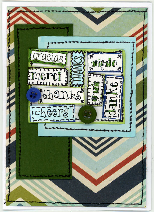
It's a small card, so I had to make it bigger.  I also decided that I needed more languages represented, and finally, I wanted to try a different edging technique, so I did some stitching, both faux and real:

The original has vellum in it, too, so I'm sorry that I didn't get to use it, but I have enough "Thanks" and other paper to make another card, so maybe I will.

Shuffled Cards - May 2016 kit - Part 2

Here is the next card in my Shuffled Cards kit for Treasure Box.  It's nearly a 6x6.

The card bases that I bought (with matching envelopes) are 5 x 6 1/2, so a little adjustment was needed.

This was an opportunity to break out my crimper, which hadn't seen action in years.  I thought this was a fun treatment for the sentiment, too.   I'm really enjoying the pen work, but I realize that the cards could also be cute without it.  Today I used a sharpie, which gives a heavier line, but the border technique is pretty foolproof - you could get it to work with almost any pen and it would look great.

I especially like the little bee - I might have to make a bunch of those for my Rosh Hashanah cards.

Shuffled Cards - May 2016 kit - part 1

I went to the StampScrap Expo in Chantilly, Virginia this past weekend, hoping to find my mojo.  I have been pretty tired of stamping lately.  I took a few classes, but even the one that was put on by a stamp company had prestamped images, so the only time I touched a rubber stamp was during a make-n-take at one of the booths (Local King - which has some of the best solid image stamps and dies I've seen, but I already have some of their stamps, so I didn't buy any more).  In fact, I was hugely unimpressed by what the vendors were offering - I felt I had seen it all before.

I was thinking about just going home when I came by a booth with a sign that said "Shuffled Cards".  I'm a sucker for a good pun, so I looked closer.  It was a subscription service - ingredients and instructions for 9 different cards for $22.99 a month, all shipping, handling, and taxes included (they primarily do scrapbook layout kits - the cards are a relatively new thing).  That seemed like a pretty good deal, so I talked to the guy.  All the fancy shapes in the kit are diecut.  The customer only has to cut straight lines.  Everything else is pen work, distressing, or some other fancy tool work - no stamping.  No stamping?  Cards with no stamping and no fussy cutting and no coloring?  This sounded like just what I needed.  The vendor (Treasure Box) sent me away with my choice of 2 kits from previous months for the price of one, and told me I could expect the first kit in the mail by mid-July.

That meant I needed to get busy!  Today I opened the first kit I selected - the May 2016 offering.  I'm not of a mind to do all nine at once, but I will show you the ones I do as I do them, and the changes I feel the need to make (you know me, I always feel the need to change things up).

The 9 cards you get in a Shuffled Cards kit come in 3 different sizes.  The largest is 6 x 5 1/2, the middle size is a normal quarter-fold size, and the smallest is 3 1/2 x 3 1/4.  Right off the top, I need to change these nearly-square cards into shapes I can mail.

This is the first sample in the instructions.  It is a small card:

I liked it but the hearts didn't fill a larger card.  As a result, I stamped and embossed an Amuse Studio stamp. I guess I'm out of practice, because I got overstamping on my background, which I tried to cover with doodles.  Here is my result:

The next card I tried was this fun kite:

I loved this fun design when I saw it at the expo, but at the moment that I wanted to make the card, this thought leapt into my brain and wouldn't leave - "Kites don't lace up, shoes do."

Because I wasn't folding the cards like the kit instructed and was using my own card bases, I had plenty of background to make two cards - one with a kite and one with a shoe.

 The kite might need a little more doodling, I haven't decided yet.  I wrote the sentiment - it really tickled me, because I hate it when people write "high there".  However, kites are supposed to be high...

Glad to see you're still kicking!

It was fun setting eyelets and building the shoe and the kite.  No stamping was needed at all. 

So what did I need that wasn't in the kit?  I used  fine line marker for the doodling (which is surprisingly a lot easier and faster than it looks), a Crop-a-dile for the eyelets, adhesives/pop dots, and distress inks (well, I'm on the fence about whether inking the edges actually improves the card).  All the ribbons and eyelets for the samples were included, and I feel the need to mention that the cardstock provided for the bases/backgrounds is  double-sided Bassil Basics printed cardstock, at least as heavy as the card bases I was using.

For my personal variations, I used card bases, scraps of cardstock, a stamp and embossing powder, a word window punch, and snippets of my own ribbon.  I feel pretty good about getting 3 cards out of the designs for 2, and I felt my mojo starting to come back!  Woohoo!

I can't resist entering my Love card in the Amusing Challenges Anything Goes challenge.  That's just how I roll.

Bra hat

I haven't made a lot of cards lately, but I did make this hat:
It's a terrible photo of me - I suppose I could have put on a bit of lipstick or something.  The hat is made from a brassiere.  I need it for an event I am attending this weekend - everyone will be wearing bra hats for Sunday brunch.  These are the sort of ladies I am hanging with these days.

Juliet Arrighi

Tim Tag March 2014

I haven't been doing the Tim Holtz monthly tags, but the one this month has an interesting technique called "smudge stamping", in which you deliberately smudge a detailed stamp.  I thought I would give it a try.
The bird he uses on his tag reminded me to the birds in the all for love stamp set from AMuse Studio, so I gave them a try.  I didn't like it at first, but the more I look at it, the more it is growing on me.
Juliet Arrighi


Layered Goosebumps ATC

I was excited to see the Technique Junkies ATC swap brought back to life by Shelly Schmidt, one of the most talented stampers I've had the pleasure to swap with.  I struggled to pick a technique to start with, until I noticed the Layered Goosebumps technique in the listings.  I had purchased a bottle of Goosebumps spray a while back, but had not had the opportunity to use it.
The mica powder in the goosebumps spray is scanning as grey splotches, but in real life, these are very textured and shimmery.  The apha punches are another thing I don't use as often as I should, but I have to admit that it is often difficult to glue them and place them in a straight line.  I also have to admit that in my basement, that backing cardstock that I also used for the letters looked black.  Sometimes things don't come out the way you plan...

The rose stamps is from a springtime day set from AMuse Studio.  It's one of the few flowers I have that isn't a solid stamp but looks fine just stamped in black.  Sometimes that is all you want.

Challenges:

Juliet Arrighi

Bouquet in a Box

I wanted to make something really special for my sister's birthday, so when I saw the directions for this card on Extreme Cards and Papercrafts, I knew I had to give it a try:
I used all kinds of flower and leaf punches and dies, and the sentiment is from amuse studio.  The card folds flat and fits in a 6x6 envelope.

Challenges:

Juliet Arrighi

Letter writing 4x4

This is a 4x4 that I made for my altereddesigns yahoogroup.  the theme is letter writing as a background, and it should be no surprise to you that the vast majority of the ladies playing are using fancy script with images of Victorian ladies or the Tim Holtz pen nibs.  I hate making what everyone else is making, so I went a completely different direction:
 The school photos and the math worksheet are printed off the internet.  The notebook paper is actually a cardsock pattern from AMuse Studio.  You may wonder why I would buy cardstock that looks like notebook paper when I have tons of the real thing, but now that I've used some of it, I have to say, it is much easier to work with (real notebook paper is translucent and fragile), it isn't white but a cream color, perfect for a vintage look like this, and it takes media much better than real notebook paper, which was only designed for pen and pencil.the stark white of the math worksheet was too extreme for the rest of the piece, so I used some milled lavender distress ink to tone it down, and I threw in a few hearts (from AMuse Studio all for love stamp set) because, well, it is a love story.

Challenges:


Juliet Arrighi

Crystal heart

This evening I made a little crystal heart necklace from a  pattern I found online:

It came to together fairly easily.  I was feeling too lazy to try to thread two beading needles, so I used tiger tail.  it wasn't bad doing right angle weave with tiger tail, and the ends came out at the perfect spot that I could thread on the lighter pink beads to make it into a necklace.  There was only one problem - running the tiger tail through the beads caused it to curl much like curling ribbon does, and it won't hang straight as a pendant.  I tried running it though straightening pliers, and hanging a weight on it to stretch it (I don't have enough time between now and valentine's day for that to work, even if it would work eventually).  I hate the idea of unstringing all those seed beads to thread it some other way - any suggestions?
Juliet Arrighi

Double kissed ATC

DISCLAIMER - my shift key is busted.  If it isn't on the first row or accessible with my capslock, I can't type it.

Kissing techniques - the first one I was forced into.  Too much colorwash spray on one piece of watercolor paper inspired me to 'kiss' it to another piece to spread the ink around a bit.  Once I had kissing on the brain, I had to try kissing my stamps, too.  The solid bird is from nordic noel by AMuse Studio, and the leafy branch which I used both for the kissing and for stamping around the edges is bird on a flowering branch by SweetStamps.

I used a waterbrush to drag the ink on the leaves around, and a tiny bead of embossing frames the image.

Challenges -
Ugh - I need a new keyboard...

Juliet Arrighi