Showing posts with label Amuse Studio. Show all posts

Ripple Art card

I was poking through a selection of coloring books and sketch books at the store yesterday, when I saw a book on Ripple Art coloring.  Apparently, the idea is to surround the various images on the page with concentric lines until all the white space is filled.  I would have immediately dismissed this as a stupid idea except that when I was in high school, that is exactly how I doodled - concentric lines filling all the empty space on the page.  Who would have thought it would become a trend?

I don't need a coloring book when I have stamps, do I?


I decided to carry through the school supply concept by coloring in colors that were similar to highlighter pens.  It was fun to do, and very different from any other card I've made, I think.  The stamps are from the basket case stamp set by Amuse Studio.


Shuffled Cards - May 2016 kit - part 1

I went to the StampScrap Expo in Chantilly, Virginia this past weekend, hoping to find my mojo.  I have been pretty tired of stamping lately.  I took a few classes, but even the one that was put on by a stamp company had prestamped images, so the only time I touched a rubber stamp was during a make-n-take at one of the booths (Local King - which has some of the best solid image stamps and dies I've seen, but I already have some of their stamps, so I didn't buy any more).  In fact, I was hugely unimpressed by what the vendors were offering - I felt I had seen it all before.

I was thinking about just going home when I came by a booth with a sign that said "Shuffled Cards".  I'm a sucker for a good pun, so I looked closer.  It was a subscription service - ingredients and instructions for 9 different cards for $22.99 a month, all shipping, handling, and taxes included (they primarily do scrapbook layout kits - the cards are a relatively new thing).  That seemed like a pretty good deal, so I talked to the guy.  All the fancy shapes in the kit are diecut.  The customer only has to cut straight lines.  Everything else is pen work, distressing, or some other fancy tool work - no stamping.  No stamping?  Cards with no stamping and no fussy cutting and no coloring?  This sounded like just what I needed.  The vendor (Treasure Box) sent me away with my choice of 2 kits from previous months for the price of one, and told me I could expect the first kit in the mail by mid-July.

That meant I needed to get busy!  Today I opened the first kit I selected - the May 2016 offering.  I'm not of a mind to do all nine at once, but I will show you the ones I do as I do them, and the changes I feel the need to make (you know me, I always feel the need to change things up).

The 9 cards you get in a Shuffled Cards kit come in 3 different sizes.  The largest is 6 x 5 1/2, the middle size is a normal quarter-fold size, and the smallest is 3 1/2 x 3 1/4.  Right off the top, I need to change these nearly-square cards into shapes I can mail.

This is the first sample in the instructions.  It is a small card:

I liked it but the hearts didn't fill a larger card.  As a result, I stamped and embossed an Amuse Studio stamp. I guess I'm out of practice, because I got overstamping on my background, which I tried to cover with doodles.  Here is my result:

The next card I tried was this fun kite:

I loved this fun design when I saw it at the expo, but at the moment that I wanted to make the card, this thought leapt into my brain and wouldn't leave - "Kites don't lace up, shoes do."

Because I wasn't folding the cards like the kit instructed and was using my own card bases, I had plenty of background to make two cards - one with a kite and one with a shoe.

 The kite might need a little more doodling, I haven't decided yet.  I wrote the sentiment - it really tickled me, because I hate it when people write "high there".  However, kites are supposed to be high...

Glad to see you're still kicking!

It was fun setting eyelets and building the shoe and the kite.  No stamping was needed at all. 

So what did I need that wasn't in the kit?  I used  fine line marker for the doodling (which is surprisingly a lot easier and faster than it looks), a Crop-a-dile for the eyelets, adhesives/pop dots, and distress inks (well, I'm on the fence about whether inking the edges actually improves the card).  All the ribbons and eyelets for the samples were included, and I feel the need to mention that the cardstock provided for the bases/backgrounds is  double-sided Bassil Basics printed cardstock, at least as heavy as the card bases I was using.

For my personal variations, I used card bases, scraps of cardstock, a stamp and embossing powder, a word window punch, and snippets of my own ribbon.  I feel pretty good about getting 3 cards out of the designs for 2, and I felt my mojo starting to come back!  Woohoo!

I can't resist entering my Love card in the Amusing Challenges Anything Goes challenge.  That's just how I roll.

Tim Tag March 2014

I haven't been doing the Tim Holtz monthly tags, but the one this month has an interesting technique called "smudge stamping", in which you deliberately smudge a detailed stamp.  I thought I would give it a try.
The bird he uses on his tag reminded me to the birds in the all for love stamp set from AMuse Studio, so I gave them a try.  I didn't like it at first, but the more I look at it, the more it is growing on me.
Juliet Arrighi


Layered Goosebumps ATC

I was excited to see the Technique Junkies ATC swap brought back to life by Shelly Schmidt, one of the most talented stampers I've had the pleasure to swap with.  I struggled to pick a technique to start with, until I noticed the Layered Goosebumps technique in the listings.  I had purchased a bottle of Goosebumps spray a while back, but had not had the opportunity to use it.
The mica powder in the goosebumps spray is scanning as grey splotches, but in real life, these are very textured and shimmery.  The apha punches are another thing I don't use as often as I should, but I have to admit that it is often difficult to glue them and place them in a straight line.  I also have to admit that in my basement, that backing cardstock that I also used for the letters looked black.  Sometimes things don't come out the way you plan...

The rose stamps is from a springtime day set from AMuse Studio.  It's one of the few flowers I have that isn't a solid stamp but looks fine just stamped in black.  Sometimes that is all you want.

Challenges:

Juliet Arrighi

Bouquet in a Box

I wanted to make something really special for my sister's birthday, so when I saw the directions for this card on Extreme Cards and Papercrafts, I knew I had to give it a try:
I used all kinds of flower and leaf punches and dies, and the sentiment is from amuse studio.  The card folds flat and fits in a 6x6 envelope.

Challenges:

Juliet Arrighi

Letter writing 4x4

This is a 4x4 that I made for my altereddesigns yahoogroup.  the theme is letter writing as a background, and it should be no surprise to you that the vast majority of the ladies playing are using fancy script with images of Victorian ladies or the Tim Holtz pen nibs.  I hate making what everyone else is making, so I went a completely different direction:
 The school photos and the math worksheet are printed off the internet.  The notebook paper is actually a cardsock pattern from AMuse Studio.  You may wonder why I would buy cardstock that looks like notebook paper when I have tons of the real thing, but now that I've used some of it, I have to say, it is much easier to work with (real notebook paper is translucent and fragile), it isn't white but a cream color, perfect for a vintage look like this, and it takes media much better than real notebook paper, which was only designed for pen and pencil.the stark white of the math worksheet was too extreme for the rest of the piece, so I used some milled lavender distress ink to tone it down, and I threw in a few hearts (from AMuse Studio all for love stamp set) because, well, it is a love story.

Challenges:


Juliet Arrighi

Double kissed ATC

DISCLAIMER - my shift key is busted.  If it isn't on the first row or accessible with my capslock, I can't type it.

Kissing techniques - the first one I was forced into.  Too much colorwash spray on one piece of watercolor paper inspired me to 'kiss' it to another piece to spread the ink around a bit.  Once I had kissing on the brain, I had to try kissing my stamps, too.  The solid bird is from nordic noel by AMuse Studio, and the leafy branch which I used both for the kissing and for stamping around the edges is bird on a flowering branch by SweetStamps.

I used a waterbrush to drag the ink on the leaves around, and a tiny bead of embossing frames the image.

Challenges -
Ugh - I need a new keyboard...

Juliet Arrighi

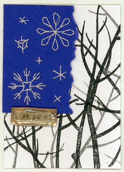
Stitched snowflake ATC

The altereddesigns group challenge this week was to make an ATC with sewing on it. I have a punch that punches holes so that you can easily embroider flowers onto paper.  It occurred to me that it could be used to stitch snowflakes just as easily.
I used the punch for the big ones, and did the smaller ones freehand.  I had a hard time figuring out what I could do to make the the snowflake panel into a complete ATC other than framing it with layers, but then I looked out the window, and saw the trees with their bare branches.  I used the seasonal branch stamp set from AMuse Studio and the depth of field technique to stamp the branches, and then I used the faux embossed metal technique to create a tiny embellishment to tie the two parts together.

Challenges:


Juliet Arrighi

Zentangled flower

This was inspired by a card on Pintrest that a friend forwarded to me.  I don't do Pintrest, but I did like the card, and it inspired me to make this one.
The stamps are all from AMuse Studio, and instead of coloring, I zentangled inside each petal.  If it looks like I cut the flower out and layered it on, that's due to the faux shadow I created with a bit of pencil.  It's a single layer card, no embellishments, no coloring, and still, I am very proud of it.

Challenges:


Juliet Arrighi

Calendar ATC

I'm still here - I just didn't want my Christmas cards to be seen by the people who were going to get them before I mailed them!

My altereddesigns group had a challenge to make an ATC for New Year's, and I really don't have any of the celebratory feelings about the new year that most people do - it's really just the end of the holiday break ,and time to hang a new calendar.  I decided that is what I would do with my ATC:
It is super easy to make a little calendar; I have been using this free program for years.  for the backing, I just used some paper tape in layers, then diecut the numbers from a Tim Holtz alpha die, and the swallow die is from AMuse Studio.  The Tiny Attacher has the perfect size staples for this calendar.  I hope it doesn't get stuffed in an ATC folder - it is too useful for that!

Juliet Arrighi

Red and green

I like traditional colors in my Christmas cards.
Snowflakes are the "flowers" of December; they make any Christmas card better.  Also improving this otherwise common and boxy card is the small amount of hand drawing.  This is a retired stamp from AMuse Studio, and fits their red and green challenge this week.

Challenges:


Juliet Arrighi

Holly Dolly

The Challnge this past week was to make an art doll attached to an ATC base, with limbs that could fold up into the ATC for storage.  This was a fun idea to me - I like making paper dolls of all sizes.  However, I couldn't think if a theme until I saw a diecut Christmas tree in my pile on the desk (POTD for you Canadians) and thought it would make a fun skirt.  Thus, Holly Dolly was born.
The holly print paper happens to be the reverse of the green snowflake paper.  I think you've seen me use this doll body (I printed a sheet of them) before on other projects, but this is the first time I've used it for a jointed doll. However, the assignment wasn't just to make a doll, but attach it to an ATC base.  As I was doing that, it occurred to me that it would make even more sense to put her on a Christmas card, so she could be displayed for the holiday season before being stored an an ATC album.  I figured out that by attaching elastic cord to the card base, I could easily display an ATC without making it difficult to remove later.
 You can see the ATC, the silver elastic cord, and the card base here.  The tree die is from A Muse Studio - I use it a lot this time of year.

Challenges:


Juliet Arrighi

Santa in the city

Santa's flight is one of my favorite Christmas stamp sets, because the image is just so iconic, and it lends itself to so many techniques.  Although the image is very large, it takes very little time to color, and and works with a lot of techniques.  However, I feel like all my cards that I make with it are the same - Santa flying through the sky.  I was telling my friend and amuse studio demonstrator about this, and she handed me another stamp set, love is in the air, which has a nice cityscape.  I decided to give it a try.

The images are embossed in silver, and I colored them first with a white pen, then went over the white with glitter pens.  Although I wouldn't usually use so much black on a card, it really makes the color pop.

Challenges:


Juliet Arrighi

Bargello

I have admired the look of the Bargello technique for a long time, but this is the first time I've tried it.
Finding the paper scraps was the easy part.  Stamping some texture on them was just as easy (I used seasonal branch and marvelous marigolds from A Muse Studio).  Cutting them to size and adhering them in place wasn't really hard, just time-consuming and very fussy.  If you try this technique, I will make two suggestions - first, make sure that the two pieces on which you are gluing your strips are completely coated with adhesive.  I used Aleene's Tack It Over and Over.  Second, use dark or black paper under your strips, so that if there are any gaps, they don't show badly.

The hardest part of this technique is embellishing it - you hate to cover it up!

Challenges:


Juliet Arrighi

Ho Ho Ho (not ugly)

My mother was lamenting endlessly about some ugly Christmas cards she had bought.  I asked her why she bought them if they were ugly.  She replied that it was at a tag sale at her friend's house; she felt that she needed to buy something, and the cards didn't seem too bad at the time.  I told her that I didn't think it should be too hard to fix them up, and she offered to send me a few as a challenge.

I got the envelope today - first of all, I don't think these were intended to be complete cards, just card bases that could be fixed up with stickers.  Secondly, they aren't ugly, just not the bright colors my mother likes.  It took me just a couple of minutes to dress one up.
You can see it's a muted green and red, but not terrible.  The colors with do well with a sophisticated or a playful image.  I had this little santa, and the right colors of markers, so I stamped and layered him up.  I started out stamping a sentiment right in the green area, but I messed it up, so I created a paper ribbon of ho ho ho's to cover my mistake.  I think a little extra white brightens the card a bit.  I think it is pretty good for not having any dimensional elements.

Challenges:


Juliet Arrighi

Stay Frosty

A Muse Studio has a stamp set called seasonal branch which screamed "Buy Me!" from the pages of the catalog the minute I saw it.  Why?  because it is a bare branch that can be stamped at almost any angle (or even straight up and down, to be a sapling), and it comes with various small stamps with which to complete it, like leaves, blossoms, berries, and even snowflakes.  It is the snowflake (3 snowflakes, actually) in particular that I needed for this card - most snowflake stamps are too big to scale with other images.

I first stamped it with embossing ink on watercolor paper, then used an iridescent powder to create my snowflakes.  I then used a watercolor wash on the background.  I like the irregular edge!  The sentiment was diecut from a Tim Holtz alpha, and the penguin is an old sticker that I got in a pack from Michaels last year or maybe the year before.  My 17yo liked it so much he asked to have it (and he has NEVER asked for one of my cards before!)

Challenges:


Juliet Arrighi

Woven Words Winter card

The challenge this week at Blessings Ink is to make a card using text as a background, and I will say that amuse studio sells some of the best text paper I've seen, but I did not happen to have any of the Christmas paper handy, and I wanted to stamp, so I practiced stamping small phrases in patterns.  I wasn't getting the results I wanted, so I ended up cutting the phrases into strips and weaving them.
The patterned paper is from a double-sided stack I bought at Michaels; the tree paper is actually the back of the background paper.  A bling star on top and a tiny touch of glitter pen on the holly added just enough to appease my need to make it sparkle.

Challenges:


 Juliet Arrighi

Fight like a girl

These cards were so fast, fun, and easy to make, and used up lots of pink scraps.

The top one is a straight herringbone technique, and the second one is a twist on a washi tape card I did recently.  Amuse studio has wonderful printed monochromatic papers, like the chevrons and petit polka dots, but others of the papers used here are simply stamped on white scraps.  The sentiments used are all from the FREE breast Cancer Awareness stamp set sold by amuse studio in October.  In addition to a lot of great sentiments, it has a ribbon stamp that also has a matching die available.  Check it out!

Juliet Arrighi

Poe Arch

This is not so different from the Poe Heart that I did a little while ago.  I was still interested in the  technique, but wondered how it would look with more distressing.
Everything except the picture of Poe is stamped with the nevermore stamp set from amuse studio.  I love the varieties of text in this stamp set.  I'm certain that I can use the stacked books and clock in other projects that aren't so spooky.  In fact I could probably use the printed text as well, if I don't think anyone with read it closely (all the text is from the poem).  Red and green are usually Christmas colors, but here they look like blood and mold.  The gothic arch form is not my favorite to work with, but it seems right for this particular subject.


Juliet Arrighi

Three Raven ATCs

The nevermore stamp set from amuse studio has a lot of dark victorian images plus 5 different text images (not really sentiments, unless you think a line from "The Raven" would make a good sentiment for a card), and they combine well together.  Case in point is this raven and this stack of books.
I like the way the raven looks on the books, but these are not the type of images that need coloring, so I thought I would give a shot to coloring outside the images.  The first one shown was colored with Twinkling H2Os, the second with acrylic paint, and the third one is done with copic markers. A tiny dot of red marks the raven's eye.

These are single layer ATCs, which is really hard to commit to if you know the stamping community.  I love making ATCs, because the goal with an ATC is to create art, not stationery.  I already have plans to swap them.

Challenges:


Juliet Arrighi