Showing posts with label TAC. Show all posts

Bee Cup

The theme for the ATC mingle is "Eek, there's a bug in my house!"  which really stumped me - I don't want to think about bugs in my house.  However, I did remember that I had this old TAC stamp:
Not exactly an "eek" moment, but I like it.  The "wallpaper" is some old Provocraft, the woodgrain paper is from a Tim Holtz stack, and the letters are diecut from Sizzix's Wingo Zingo alpha - possibly the best alpha die ever made. I used the Technique Junkies Layer Up and Penciled Markers techniques - it's not as simple as it looks.  Is that a good thing?

Challenges:

Juliet Arrighi


Twinkling ATC

On the ATC_World yahoo group, we were discussing the virtues of Twinkling H2Os versus other paintable mica powders.  Finally, one lady pointedly hinted to me that she would love a sample to see in real life.  I generally avoid people who request cards outright without even an offer of a swap, but I am feeling benevolent in my old age - I have thousands of ATCs, and make them because I enjoy making them, and certainly not because I want to have more of them to store.
The thing that I love about twinks is that they are more like watercolor paints with a little sparkle to them than they are mica powder.  You can't see the sparkle at all in this scan, just the pigment.  You get the transparency and shading of a watercolor.

The tiny tag is resin, I think.  I complimented another ATC maker a few years back on how cute a similar tag looked on one of her ATCs, and she sent me a packet.  I love how cute they are, and how well they take ink.  Unfortunately, I hate to use them, because I have no idea how to replace them.  I shouldn't hoard my goodies, I know.

The bird image is from SweetStamps, and the kanji is from TAC.

Challenges:

Juliet Arrighi


Cardinal ATC

I needed a winter bird ATC, so I used my old TAC cardinal - my favorite winter bird stamp, if you don't count the doves (doves are awesome for Christmas).
I will say I had problems.  The background is some white paper that I painted silver, for the shimmer and for the brush strokes (I love the look of a painted background!).  I stamped with Memento black, which took okay, then I tried coloring it with copics.  The copics did not adhere well - when I tried to bring in colors for blending, it took off the original colors.  I then decided to try my glitter pens, because, well, you know how I am with glitter pens.  I then blended the glitter pen ink with my LaPlume markers, which worked surprisingly well.

I couldn't resist framing it with a little bakers twine.  I love the look of the bakers twine with the cardinal!

Challenges:

Juliet Arrighi


Pedestal Pop-up card

I was intrigued by this challenge on the Sweet Stamps blog to make a pedestal pop-up card.  Since I just bought this stamp from them, it was a natural to put the two together:

The sentiment is an old SU stamp, and this butterfly on the inside is an old TAC stamp:
It looks like it's flying over the card!  I left plenty of white space for writing.  The framing lines are drawn with a marker and clear ruler - it's an easy way to add a little color and definition to the inside.

Other challenges:
Kaboodle Doodles - Thank you card
Squigglefly - new technique
Cutie Pie - border/frame
Stampalot - flight


Juliet Arrighi


Butterfly Thinking of You

I needed a sympathy card.  I always like butterflies on a sympathy card.

The butterfly is from The Angel Company. It's a 2 step stamp, but this is the first time I've used the stamp for the color inside the wings.  Usually I just color it myself.  It's a little off, but somehow that looks all right to me.

Challenges:
Rainbow Lady's - butterflies
My Mum's Craft Shop - stamp it
Ribbon Carousel - anything goes (3 spooled items)
Stamp N Doodle - embossing
Use it Tuesday - uninked stamp
Juliet Arrighi

Vellum pocket card

This is another card that I assembled according to Chris's directions.  This used a vellum pocket to hold the tag, and I don't really ever use vellum, so she gave me a piece of hers.

The first thing I noticed after I glued everything down was that I used the wrong paper. (you can see Chris's version here.)   I was supposed to use a very interesting textured background paper, and instead, I used solid colored cardstock.  the result was a little plain, so I stuck some bling in the corner.  I'm not sure it improved anything.
You can see the stamping on the tag through the window.  Anyway, I had to do it in Reese paper too, and was in a quandary about what to use for vellum, when I found an old (7-8 years) sheet of patterned vellum that I had bought and never used - I never know what to do with vellum.
A tree stamp in the background seems to give that little something that keeps the solid background from being bleah.  I am loving using these tags!

Challenges:
Fashionable Stamping - ribbon
Just Add Ink - something from your stash (vellum)
Stampin' for the Weekend - holidays
Winter Wonderland - a decorated tree
Pixie Dust Studio - tag
Juliet Arrighi

Red and Gold


Red and gold is the final challenge this month at Gingersnap Creations.  This is a card that I had in my head since I started being the Monthly Muse, to juxtapose the geisha stamp (from TAC) with a fan, almost as if she were holding it.  The double-sided paper is from GCD Studios. The fan is from my tutorial; I just can't stop once I get going.

Challenges:
Stampin' Royalty - sketch
Ladybug Crafts - fashion
Card Cupids - punches (used on fan)
Digis with Attitude - Asian
Stamptacular Sunday - at least 5 layers

Juliet Arrighi

Easter Card on Passover?

Happy Passover!  This is not my Seder night, as my husband is out of town until tomorrow, and that is when my son and daughter will come for dinner too, so I quietly blessed and ate my matzah and went on with my evening.  I knew I needed a card for my mother in law, and I was absolutely in love with this image (cutest bunny ever!), so...

 
The image is from Sliekje, of course, printed on poison ivory iridescent paper from the PaperTemptress. The patterned papers are from an old CTMH set, Victorian Elegance, and so is the copper cardstock and copper brads.  The sentiment is from TAC, so you can see I don't really have any brand loyalty to anyone.  I just buy what I like.

Challenges:
Creative Belli - bunnies
For Fun - colors
Lil Red Wagon - Easter
The Paper Variety - Flowers

Fun with Shapes and More - animals
Crafty Catz - Furry Friends
Nettie G - color a favorite digi

Juliet Arrighi

Fairy flight

I was tasked to make a large (8.5 x 5.5 inches) card for the whole bowling league to sign, to wish one of the members a speedy recovery after surgery.  I knew the usual motif in these instances is flowers, and I know Michelle Zindorf designs nice cards, so I paged through her tutorials and found one that seemed to fit the bill.  Since I did have any of her stamps and didn't feel like brayering, It ended up looking like this:
The coloring was all done with pencils.  Of course I used Masking and burnishing to color the sky, and  I used a combination of the Puzzle Layer and Paper Piecing techniques on the flower.  I decided to pass on the ribbon - it isn't only an issue of mailing, but when people are writing on both sides of the inside of the card,  it isn't very nice for them to have to work around lumps.

Challenges:
Kerry's Color throwdown - colors
Amber's Crafts and Stuff - favorite things (techniques)
Crafty Creations - paper piecing
Creative Card Crew - Spring
Flutterby Wednesdays - soft pastels
The Paper Variety - flowers
Color Throwdown - colors
Creative Stamp Friends - swirls
Juliet Arrighi

Bookmark doll ATC

I have been practicing making Japanese bookmark dolls in anticipation of writing a tutorial, and I wondered how small I could go.  I thought I would try an ATC, which required a half inch head. 
After I made it, I decided to attach it to a larger card but keep it easily removable, which is why there are two paper clips holding it in place on the card front.  It may look a little strange, but the recipient should appreciate that there isn't goo all over the back.

For the record, these types of dolls traditionally do not have faces or arms.  I would have liked a little pink mouth in there, I think.  I decided that since this card is going to be mostly disassembled by the recipient, I didn't need to lose a lot of sleep over the sentiment - I just grabbed a pen and wrote the words.

The patterned paper is Fruity Fusion from TAC.

Challenges:
Cupcake Inspirations - photo inspiration
Card Cupids - dots and stripes
Craft your days away - spots and stripes
Shannon's Sentiments - use an oval (the hair)
Wee Memories - favorite color palette
Sir Stamp a Lot - ladies and fashion
Stamping Vacation - pick 3 (circle, corner punch, sentiment)
Moving Along with the Times - more than one fold (the kimono)
Pals Paper Arts - punches
Gingersnap Creations - office supplies (paper clips)
Juliet Arrighi

White wedding

I hate weddings, but I love wedding art. I don't know if it is the elegant style and austere palette, but wedding cards always leave me with a great feeling of satisfaction.

I mentioned yesterday that I got free stamps sets from TAC when a couple of items I ordered came in late. These items were small items, too - spools of scrapper's floss. The stamps sets are probably worth than the floss cost. Anyway, one of the sets had a couple of small cakes in it, including this wedding cake.

It doesn't really show in this scan, but the cake is embossed in silver.  I've used the white on white technique to show it off - 5 different punches were used to layer up this card.  I made 8 for the technique swap on RubberStampChat, and a few extra to layer up in card bases in case I need a quick wedding card.  I really like how the white on white looks, but it eats up a lot of cardstock!

Challenges:
A Gem of a Challenge - anything but square
Fun with Shapes and More - no designer paper
Just add ink - just stamps and cardstock
Simply Create - diy
Tellen's Place - texture
Dutch Dare - celebrations
Meljens - punches
Pals Paper Arts - embossing
Stampinsanity - punch it out
Cupcake craft - monochromatic

Juliet Arrighi

Playing with pencils

I was stamping at my friend Chris's house yesterday, and we used pencils on Kraft cardstock.  I was really impressed at how well the Kraft took the pencil, and Chris was kind enough to give me some of her scraps (because I don't have enough scraps at my house!), so I played with colored pencils and Kraft cardstock today.
I was experimenting to seeing if this TAC stamp would fit on an ATC (the answer is yes, but forget about a border - It's on a 3 x 3.3 piece here).  I had a little trouble with the coloring, in that I didn't make a good impression and couldn't see what was hair and what was a flower.Other than that, I like coloring with pencils on Kraft!

Challenges:
Card Patterns - sketch
Shelly's images - what you got
Southern Girls - flowers
Scrapbook Sisters - spring flowers
Flourishes - butterflies
Magical Monday - fantasy plus spring

Juliet Arrighi

It gets better

I've been a little angry with myself lately, and it has interfered with my creativity.  I had a disagreement with a friend about a mutual friend who had lost her dog (well, not lost, the dog (a greyhound rescue) darted of the house and ran full bore 3 blocks to a busy street and got run over.  Greyhounds are like that).  Anyway, the disagreement was about whether or not the friend should get a sympathy card.  I make sympathy cards all the time, for people who have lost relatives, but not for people who lose pets.  That is where I draw the line.  Just the week before, a different mutual friend lost her elderly mother in law, and that is a good reason to make a sympathy card, in my opinion.  My friend argued that the woman who lost her mother in law was in less emotional pain than the one who lost her dog, because the mother in law was very old and in pain and mentally foggy, and that for her, death was a mercy, and the woman who lost the dog suffered the shock of a surprise death, plus she had a mourning child and other dog to deal with, in addition to her own unhappiness.  She felt that the dog lady needed a card more than the MIL lady.

I understood what she was saying, but I did not capitulate - it is a slippery slope.  First it is cards for dogs, then cats, then parakeets and gerbils, and the squirrel that runs out in the road in front of your car - once you start making cards for animals, you may as well be lining bird cages with them.

However, I did feel badly.  I really like the woman who lost her dog.  She is a great friend.  I did not make her a card, and my muse walked out.  I think maybe my subconscious is smarter than my conscious mind.
I will be seeing her tomorrow.  This is not a sympathy card.  It is a "I know things are crappy right now and I want you to know that I care about you" card.  I know technically that is the definition of sympathy, but let me have a little bit of dignity left.

Details: The background is DCWV cardstock embossed and sanded.  The butterfly is TAC, I've had it for ages but never used it the way it was designed before now (2-step stamp).  the ribbon I've had for ages, and this is the first time I've used any, and this is the first time I've used this sentiment stamp, although I've had it for ages, too.  The sentiment and butterfly are heat embossed using some iridescent UTEE my buddy Diane gave me, and the flower is a RAK - I don't remember who it is from.

Challenges:
Cupcake Craft - up in the air with green
Diecut Dreams - special friend
Let's Ink It Up - embossing
Pile It On - green and orange
Sentimental Sundays - green plus a sentiment
Corrosive Challenges - Sketch
Phindy's Place - well wishes
Crafty Purple Frog  - things with wings
Juliet Arrighi

Delicate Florals

My friend Chris is a TAC demo, and the other day, instead of the usual hostess club project, she set out a stamp set (Delicate Florals - It's on sale this month!) and some TAC papers and markers and let us do whatever we wanted.  She should know better than to do that with me - I always send her down into her stash to get me something else that isn't already on the table.

Anyway:
Hmmm, looks completely different scanned!  This was watercolored with Tombows.  All stamps and papers are TAC.  I used the torn frames technique from Technique Junkies.

Challenges:
TAC Savvy Projects - You make February Fabulous
Color Dare - plum, artichoke, neutral
Creative Cottage - florals
Forgotten Scraps - flowers
Inspirational Card Sketches - sketch
Oldie but Goodie - Spring is in the air


Juliet Arrighi

From the Heart Blog Hop

I struggled to find an appropriate focal image for this card, but when I put the little charm on instead, it just worked for me.  It's as if paper isn't good enough, that love requires the permanence of metal.

It's a joy fold card, although it is listed in the Technique Junkie library as a Flap Fold card. This is really a linky
hop - there isn't a specific sequence, but all the participating blogs have the same linky, so you can just click the image of the card you want to see next from any blog in the hop.  It's pretty cool - try it!


Juliet Arrighi

CASEing a masterpiece

My friend and TAC demo, Chris had a workshop the other day in which we made "masterpiece" cards, which is to say, cards of such detail and quality that only the best card designers could execute them. For example, consider this card:


This was not a quick card to make.  Even with many of the pieces already cut out, it took some of the ladies over an hour to complete.  It probably doesn't how, but there is both heat and dry embossing, and the poinsettia, which is colored with Copic markers (how many demos let you use their Copic Sketch markers?) is actually three-tiered paper tole. with stickles in the center.  For most of use, this was the first time using a Martha Stewart Punch-around-the-Page set. 

I was tickled with how well the card came out, but I wondered - could I duplicate my results at home?  I didn't have the beautiful TAC poinsettia stamp, but when I saw Faith's free digi, I thought I would give it a try.

I first went wrong when I used glossy paper for my poinsettia.  The glossy helps with blending, but the finish just didn't look that great.  I didn't have the the same punches or stamps, either, and Stamping Up paper just isn't as nice as the paper TAC sells.  This card is still better than what I can design myself, though.  I might have to try this again.  If you didn't know how nice the original was, you might think this is really good!


Linkage (challenges):
Designed2Delight - digital image (freebie!)
Gingerloft - bows
Karber Christmas - Christmas + digi
Craft Your Days Away - texture
Alphabet - foliage
Tuesday Throwdown - embellishments

Juliet Arrighi

Hanukkah treats

I like it when Hanukkah doesn't overlap Christmas, I can keep the two celebrations separate.  I am Jewish, and my husband is Catholic, so we have extra holidays in our house.

My sister and I spent some time this past weekend coloring, and made these little gift baskets.

The pink one is from a design on Splitcoast.  I made it first, but when my 22yo son Gordon saw it, he didn't like it at all;  he wanted a more open design that holds more treats.  He then came up with the folds for the blue basket.  The pink one was colored with the Penciled Twinks technique (it has a really nice shimmer); the blue one, colored by my sister, used Tombow markers and a blender pen.

Notice, if you will, the staple details on the corners.  I did those with my new Tim Holtz Tiny Attacher.  I love it.  The staples are so cute!

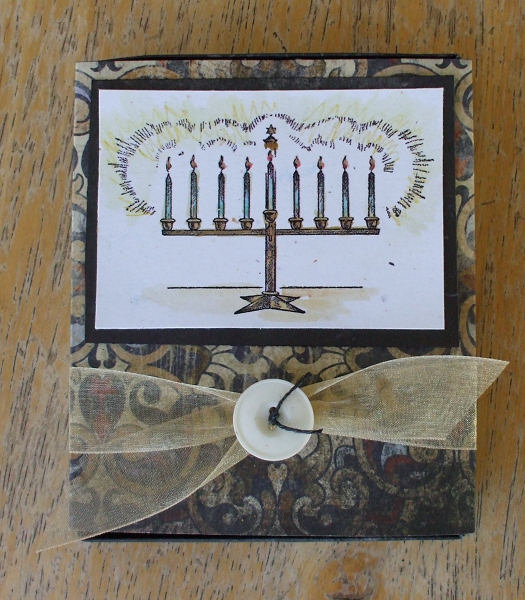
Anyway, I did another project for Hanukkah - this candle box.

It looks so much better than the ugly boxes that the candles come in!  This is nice enough to leave sitting out.
I picked up the directions for this box from Ellen Hutson, the papers are Kahmalaht from TAC, and all the Hanukkah images are free from Digital Two for Tuesday.  There is glitter pen on the flames and highlighting the metal, for extra sparkle.

Of course there are challenges:
Cupcake Craft - light it up
Karber Weekly - digi and sparkle
I Did It Creations - surprise (were you expecting Hanukkah projects?)
Paper Sundaes - fancy corners
2 Sisters - not traditional Christmas (ha ha!)
Bee Crafty - something hidden
Marks Finest - bows
Sweet Stampin - buttons and bows
Fairy Fun - buttons and bows
Mami Doodles - gift item
Wags and Whiskers - wrap it up
Moving Along with the Times - multiple folds
StampInsanity - try something new
Cheerful Stamp Pad - deck the halls

Thanks for looking!

Juliet Arrighi

Stand-up Thanks

If you've been stamping for a while, you've probably seen this sort of stand-up card.  I think it is a very cool type of card, but I can tell you from experience that most people would not know how to set it up if they received it.  It mails completely flat, with most of the card hidden inside the box, and I've seen people fumble with it and never get it upright.  I would be hesitant to mail it to a non-stamper.

Anyway, the story behind this card is that I made it at a TAC hostess club meeting, and Chris, our demo, had both Bic Mark-its (my preferred alcohol marker) and Copic Ciaos set out to color the images.  This is the first time I had both in front of me, and I have to say, the Ciaos did handle better, and to make a long story shorter, I ended up buying a set.  By a set, I mean a Caboodle set - TAC sells Copics in Caboodle packs, which is 12 markers - 4 colors with three shades of each color for blending.  The Caboodle sets also have coordinating cardstock you can buy so that you can be 100% certain that your colored images will go with the card you are making, which eliminates most of my concerns with coloring in general and Copics in particular.  I would hate to spend a lot of money on markers and not have the right blending colors, and I hate coloring an image and finding out afterward that it doesn't match any of my papers.  TAC even has beautiful designer papers to match the Caboodle colors - it's really a great concept.

My last big concern with Copics is the cost, but since this was my month as hostess in our hostess club, I got my Copics at 40% off, so I should be good to go!   

There are a lot of challenges right now for thank you cards in autumn colors:

Craft Your Passion - doubles (the acorns)
Stamp Scrap Doodle - fall
Our Creative Corner - gratitude (I'm grateful for my friend Chris who showed me how to do this!)
Crafty Emma - autumn
Digi Doodle - autumn
Shirley's 2 Girls - thanks
Cheerful Stamp Pad - thanks
Tip Top Tuesday -  color with copics

Juliet Arrighi

Self-challenged

Last week I went to a Christmas card workshop.  I liked the stamp set we were provided, and the paper set is one of my favorites, too, but the cards just did not move me.  I think it is because I like a lot of shimmer and shine on my Christmas cards, or at least bright colors, and these cards weren't really either of those things.  My challenge to myself today was to take the stamp set and the leftovers and make a card closer to my tastes.
There is shimmer all over this card, from the Laser Lustre paper and pearlescent embossing powder to the pink organdy ribbon and the mother of pearl button.  There would have been even more if I had Versamark Dazzle, but I just used regular Versamark for the swirls and corners on the background paper. The little tag is from the paper pack (Reese) which, like the stamps, are sold by The Angel Company.

In addition to my own personal challenge, this card fits a few others:
GingerSnap Creations - Versamark
Crafty Cardmakers - Stitching
Crazy Challenge - Pearls and swirls
Critter - Christmas
Little Paper Shop - Buttons and bows
Stamp with fun - Things that fly


Juliet Arrighi

New Catalogs!

All the new stamp catalogs are out! This week I've seen the latest SU, CTMH, and TAC catalogs, but I think the TAC catalog has the most exciting stuff in it! I already have my hostess club purchases mapped out.

One of the really cool things that The Angel Company catalog has that the others don't is the Copic Caboodle sets. I know, you can get Copics online all over, but TAC sells them with matching cardstock! Seriously, this has been my biggest problem with alcohol ink coloring - after I color, it doesn't match any of my paper! Plus, the sets coordinate with the designer papers TAC sells, so you end up with colored images you can USE!

Secondly, they sell stamps that fit perfectly with Nestabilities (yeah, they sell the Nesties, too!) They also sell stamps that fit their punches (okay, SU does this too, but TAC does it better for less money)

I was at Chris's house today, looking at the catalog and doing a couple of make and takes. Here are the cards she had for use to try:


On this card, you can see the frame stamp is designed to work perfectly with the Nestie. You can't make out the damask medallion on the background, but it looks very sophisticated with the speckled paper.


This isn't a new stamp, but it's a great set, and on this card, we colored the image with pencils and blended it with OMS. Chris designs such great cards - It's a pain to drive to Springfield just to stamp, but she makes the trip worthwhile.

Juliet Arrighi