Spring? Where?

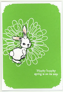
I woke up to snow this morning - not appropriate for spring break, is it?  Well, at least I can make it spring on my cards...
I have a ton of medallion stamps, but I like the naturally lacy look of this marigold.  it doesn't take a lot of color to do a white rabbit.  This particular rabbit is from a•muse studio - it's cute without being cartoonish or childish.

Challenges:


Juliet Arrighi


Bumblefly

When I bought this stamp set last week (10% off this month only, from a•muse studio), I remembered that I had some cute bumblebee brads that would be adorable with the hive image.  Unfortuantely, I didn't dig them out until I had already placed everything; that's when I discovered that they were actually butterflies, not bees.  This is not the first time I've made that mistake with these brads - I remember that they are black and gold, and not so much what insect they are.
I also pulled out my chalks, which rarely see the light of day.  It's an extra step to spray them with fixative, but I do love the soft haze of color that you get with chalks.  I used the Pastel Detailing technique from the Technique Junkies newsletter.

Challenges:

Juliet Arrighi


Beer Glass card

I was discussing with my cronies the Beer challenge at Blessings Ink, and Lois told me about a card she had made that used a transparency for the beer mug .  I thought it was a very cool idea, and decided to try it myself, only making a Pilsner glass (my husband's preferred beer receptacle).
I stamped the background with the vintage labels set from a•muse studio; I thought they were evocative of beer bottle labels.  I hand cut the "glass" and the gold cardstock that I used for the beer.  The foam was cut using the cloud die set from a•muse studio.

Challenges:

Juliet Arrighi


Honey Remix

I was in a mood...
This is for the Teddy Time challenge at Vicky's Place.

Juliet Arrighi


Old, new, borrowed, blue

Here is another chalkboard technique card.  This is a fun way to use stamps I would normally color  and it stands up to any background.  I just bought this stamp set from a•muse studio, and this is the first time I've used it.  I thought the blue gingham went perfectly with the picnic basket! The gingham paper and my crimping tool are probably two of the oldest things in my stash.  the dragonflies were getting lost in the busyness of the gingham paper, so I borrowed the offset printing concept from my digital work and applied it to the punchouts.
Challenges:

Juliet Arrighi


Chalkboard Technique

My friend Chris showed me this technique last week, and I decided to give it a try.
One of the great things about having a black focal image is that it goes perfectly with white designer papers.  I had this old DCWV paper in my stash forever - it needed to be used.

Challenges:

Juliet Arrighi