Drunk frog on the cheap


It is amazing how cheap I can be. First of all, this image is is royalty free clip art, no cost to download or use, and it is not colored with copics, I used the Bic Mark-its. The ribbon is the cheap stuff at Michaels, and the felt flower is from the One Spot at Target, and the paper was a gift from Chris, who didn't spend all that much for it, as it was from a stack of My Mind's Eye that she bought at Costco. Even the glue dots I'm using to hold everything together are homemade. I know what you are thinking - Vintage Silver Lustre paper - that has to be expensive, right? Nope, The text weight (best for running through printers for digistamps like this one) is very economical, only pennies to print an image like this one, and it really elevates a card to have such luscious paper on it.

The card is inspired by the Card Patterns sketch this week.

In the inside it says, "I wish all the single guys out there were not like this one!" It's for my sister...

Juliet Arrighi

Good mail day

Last week, Diana took me up on my offer of a free ATC, but she was insistant that she should do something, and offered an SASE. I declined, and said that if she really needed to send me something, she could make me an ATC in return. She protested, saying she never made ATCs before, but I insisted. This is what I received in the mail today:


These are done in the Smashed Blossom Technique - all those flowers and leaves used to be on plants until she came after them with a hammer. It's not only a fun technique, but it can be good therapy, too.

Not only did she send these ATCs, but she enclosed them in a beautiful long card and a fabric and paper wallet. She also included some gorgeous kaleidoscopic embellishments. It was a heck of a haul, all things considered.

Thank you, Diana!

Juliet Arrighi

Phoebe

My niece's birthday is on Saturday, so I made her this card. You may think that my niece, Phoebe, likes corgis, and she probably does, but the truth is that Phoebe is a corgi.


This card loosely follows Aly's Sunday Challenge - there just wasn't room on this little card for all the embellishment the challenge required.

I love this ruche paper! A patterned paper or even an embossed background would have been too much, I think. The ruche paper has such a luxurious look and feel, and it doesn't overwhelm the rest of the card.

It's funny that I should remember to send a card for Phoebe when I forgot to send one to my sister (her mother/owner/servant).

Juliet Arrighi

Matching card

I mentioned yesterday that I wanted to make a card to match the treat box I made.


The pumpkins and the sentiment are all cut out of the patterned paper, and the pumpkin in the middle has been embellished with a stardust pen. I like my card, but now I want to put pumpkins on the outside of the treat box instead of foamies.

Juliet Arrighi

IldiCo bear

I knew vintage images would look good on Vintage Silver Lustre, but how about contemporary ones? This cute bear is from Ildi Co. I used the Van Gogh technique to perk up the leaves, and some faux stitching.The layout sketch is from Truly Scrumptious.


I really like coloring on the Silver Lustre. This paper might make a digistamp fan out of me. Note that I used regular markers and a blending pen - remember those? People were blending their colors before there were copics.

I photographed this so you could see the shine of the sequins and the metallic ribbon, as well as the grain of the Vintage Silver Lustre Paper. The background is DCWV, and the little sentiment was a freebie stamp from TAC.

Juliet Arrighi

Sweet Treat origami

I wasn't really focused on playing in the Saturday Spotlight challenge this week, but I saw a cute origami star box on another site and thought to myself, "how cute would that be with double-sided paper?"

I happen to have lots of double-sided paper, and decided to give it a shot.


I changed it from the usual star box by curling the points, and I threw on some green ribbon and black twine to bring out the color in the pumpkins, and then I just couldn't resist sticking on a few foamies while I was at it. It could not have been easier, no cuts, no adhesive, no stamping.

The candies are York Peppermint Pumpkins, my husband's favorite.

The next challenge should be to make a cute card with that orange pumpkin paper to go with it.

Juliet Arrighi

Laser Lustre

You might think that I'm talking about PaperTemptress' Laser Lustre Cardstock that I used in the last card that I did, but really, this is a personal thing - could I run my Vintage Silver Lustre paper through my laser printer? I had no doubt that it would work fine with an inkjet printer, because it takes ink so well, but toner is another matter.


You can see that this digital stamp (from Digital Two for Tuesday - free, of course)printed perfectly, and I colored it with no problems. I sometimes have a problem with coloring digital images because the toner will lift off the paper when it gets wet (because I'm using water-based markers, not copics), but the Lustre paper is much nicer for coloring than GP110. The paper is from My Mind's Eye, and all the ribbon is from Michael's.

This card is for the current Cardvaark's challenge to make a tall card. I do love a challenge.

Juliet Arrighi

Queen's Progress

The big problem I had been having with the queen image is that I couldn't get the gold Celtic frame gold enough. The only real metallic colorants I have are opaque, and obscure the stamping. It them occurred to me that I should stamp the frame separately, and paper piece it onto the portrait of the queen. Fortunately, I happened to have a piece of Gold Laser Lustre:


You can see the improvement in the color in this scan, but not the reflective nature of the Gold Lustre. Here is a photo.


Here you can see the grain and shimmer of the Gold Lustre. The Laser style has this vertical texturing that gives the paper a very formal feel. It stamps and paper pieces very well. The portrait was done on the free pink parchment that the PaperTemptress uses for her invoices. The layout is from Aly's Sunday Challenge, proof positive that a ten year old can design a better card than I can.

The card looks a little bluer in the photo - I think the scan translates colors better. Which do you think I should use more often - photos or scans?

I'm about done playing with the queen. There is a king and a knight in that stamp set...

Juliet Arrighi

Shout Outs

I make those funky little cards that I call "Shout Outs". they are 3.25 by 4.25 inches, just the size to cut 3 from a standard sheet of cardstock. I make them specifically for one purpose - to mail a single ATC. I don't like to put just an ATC in an envelope, I like something to surround and protect it, and a shout out is just the thing. I have a few rules for my shout outs:

1. They have to be flat. no ribbons or brads or other lumpy things are allowed. They are supposed to make my little ATCs easier to mail, not harder.
2. It can't take longer than 10 minutes to make all three of them. These are not "real" cards, they are just protective coverings.
3. They have to be ugly - I don't want the recipient to feel like they have to treasure it, and I especially don't want them to feel bad if they sent me an ATC without anything else.

I usually build them from scraps laying on my crafting desk, and often they will consist of gluing a failed ATC glued to a base. Not today, however - I had a small branch of silk leaves lying on my desk, so I used them instead.


It is easy to get silk flowers and leaves to lie flat if you take off the plastic bits. You can see the glue where it smeared around the edges, and the white speckles are glitter that came on the leaves. The orange paper was a scrap lying on my cutting tray, and the faux stitching is very fast if you use the Drywall stitching technique.

No one should have any difficulty tossing this out.

Juliet Arrighi

Sepia on Velvet

When I read the Sepia Technique tutorial, I knew wanted to use it with this stamp. Then I got some Velvet Touch cardstock from the PaperTemptress, and I really wanted to use it with this technique.


As an ATC, it's pretty simple in design. There is just enough layering, variety of materials, and embellishment to keep it from being boring. however, the real "Oh!" moment comes when you touch it - it is soooooo soft!

I'm making as many of these as I can get out of a single sheet of cardstock, and I would like for as many people to be able to touch it as possible. If you are in the Technique Junkies swap, some of these will be set aside just for that swap. Otherwise, please let me know if you are willing to swap for one - you can click my name below and it will go to my email.

Juliet Arrighi

HRH

I thought this TAC stamp would go great with this paper.


This is why I do layout challenges - if I don't all my cards end up looking like this one. Focal point centered at the top third mark, ribbon or paper break at the bottom third mark, and a sentiment or embellishment in the lower right corner. I should know better than to build a card without a layout sketch. It's like sewing a dress without a pattern - it ends up looking bland, weird or you ruin your materials making something unusable.

Now, the good part - I stamped this with regular ink on glimmer paper (PaperTemptress, of course), and heat set it. I used the TJ blended glitter technique. The slow-drying paper really helps this technique. The background paper is DCWV, and I couldn't resist adding HRH alphas.

Juliet Arrighi

The queen

I needed a small quick card, and saw that I had these TAC stamps waiting to be cut and indexed. I figured it would be sensible to use one of them for the card I was going to make, so I reached into my stack of new PaperTemptress papers and pulled out a sheet of pink parchment. Pink parchment? Did I order that?

I flipped the sheet over and the mystery was solved - PaperTemptress prints her invoices on pink parchment. I was not looking at a purchase, I was looking at the invoice. Still it was parchment, perfect for the stamp, and it looked clean on the back, so I used it. I suppose every order from the PaperTemptress includes a free, slightly used sheet of pink parchment.


There is a lot wrong with this card and with this scan. I wish there was some way to make the glitter sparkle in the scanner bed. The words are really much clearer in real life, it's the glitter that makes them look funny. The texture of the ruche paper isn't showing at all.

Back to the drawing board. This card is going in the mail, it looks much better in real life.


Juliet Arrighi

Just for kicks

Paper Popsicles had a shape card freebie on Friday, with a challenge to use it on Monday. I downloaded the template, but felt uninspired. Why would I want to make a card that looks like a boot?

It was not much later when the mail came. My mother, wonderful sweet person that she is, bought me an assortment of luxury papers from the Paper Temptress. Patricia (the Paper Temptress herself) thought it was so sweet that my mother would get me such a nice selection of papers for my birthday threw in an additional little birthday present - some very cool leather papers. Suddenly it all clicked.

Leather paper + Boot template = Leather Boot card.


The card stands up and opens up like a regular card, although you cannot tell it from the scan. The natural color layering that occurs with markers created the stacked heel effect, and the stocking was a scrap of pink mulberry paper. The faux stitching was done with the fine point end of the same marker that colored the heel and the lining, and I used the twisted edge technique for the ribbon. The Paper Temptress leather papers can be used like regular cardstock - they take ink perfectly, and the come in great leathery colors. I wish you could see the texture in this card.

The hardest part was coming up with a good pun to write on the inside:

"I thought you'd get a kick out of this!"

Juliet Arrighi

What is zettiology?

If you ask, nobody knows, but people who are familiar with the term know what it looks like when they see it. Here is my best guess - Teesha Moore, tired of people looking at her work, shaking their heads and walking away, whispering "I could do that", decided to work it to her advantage and told them "yes, you can", and found a way to make money be encouraging people to copy her style of mixed media collage.

Tonight I gave it a half-hearted effort:


My strongest feeling about it after this first attempt is that it is not very easy to do on an ATC - it needs to be done on a larger canvas. Teesha herself encourages scanning and resizing the results. However, nobody want s a print for an ATC, they want an original. I'll have to try this again.

Juliet Arrighi

Lucky me

I won another blog candy on Shelly's blog - five sets of little acrylic stamps. Here is a card that I made with one of the sets.


It started off as an ATC, then I kept adding things until it grew into this 4x9 card you see here. The stamps are so tiny, you wouldn't think at first that they would work on such a large card, but I like how this came out.

Shelly sent them along with some great AI Foil ATCs for the Technique Junkie ATC swap - I will show them to you as soon as I trade them all away. I don't like to spoil the surprise.

Juliet Arrighi

Sig tags and Google

Sig (signature) tags were the reason I learned to use Paint Shop Pro all those many years ago. I hated that other people had cooler email than I did. Of course, as soon as I started using sig tags myself, the recipients of my emails started complaining that my emails were too large and it was taking forever to upload their mail packets (those were the days of 14,400 modems); I had to stop using them as soon as I started, and so I found other things to do with PSP, but I never got back into using sig tags on my email.

I do have sig tags other than the one I use here, here are some I use currently in other places:


I scanned a Glamour Shots photo to make this tag. The picture is about 12 years old, but don't I look gorgeous?


I use this one a lot this time of year.


This one (and several of the others) was made for my position as a moderator in Stepping Stone Through PSP. I love this program for creating digital art and photo correction, and am thrilled to help others learn it as well. I wrote a tutorial on how to get this Warhol effect as my "graduation" project from the course.


This cat tag was an assignment I did while taking the SSTPSP course.


Just your basic photo tag.


This one uses a Yahoo avatar as the image. I like to think I look this good. Yes, I am in the Red Hat Society - I have another tag like this one that shows me wearing a hat, but it looks a little awkward, so I like this one better.

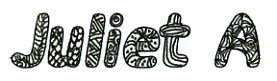
The one I use at the end of my blog posts I drew just to match the header, which I also drew. It does a couple of things that most other people's sig tags don't do.

First of all, it is a clickable link to my email address. I have mentioned that before, and I think that if I say it enough times, one day one of you, in a desire to contact me, will remember that, and think, "oh, I know how to email Juliet, I will just go to her blog and click her sigtag!" This assumes, of course, that you have either bookmarked my blog or are following it, but then, why wouldn't you?

Secondly, I have put my full name as the alt text. what this means, for those of you who are not html savvy, is that if you hover your cursor over my sig tag below, you will see my full name. Why would I do that? Google. I have a fairly unusual last name, and I don't want to give it out freely to just anyone traipsing through, but if you are someone who knows my name from other places (i.e. real life), if you google it you will end up here. That's a good thing.

If you would like me to make you a custom sig tag, I will happily do it for linkage. I can do it with or without the extra functions, as you prefer. If you have been reading this far, you know how to get ahold of me.

Juliet Arrighi

Burned out

I really like the tri shutter card, and was quick to recommend it to a friend who wanted me to make a set of souvenir cards for her with whom she is taking a cruise at the end of the month. I have made cards for her group before, and didn't think it was any big deal, until she told me she needed 30 of them.


I was very fortunate to have enough matching cardstock, for the project, and the design for the card is mostly digital - I created the panels in Paint Shop Pro, then printed them, cut them out and glued them to the tri shutter base. I'd spent the time designing last week, and I didn't think it would take that long to print them out and assemble them.

I was wrong - I spent the better part of an hour just with the cuts and folds for the bases - thank goodness I have a Scor-it board. I thought it was a frivolous expenditure at the time I asked my husband for one for Christmas, but I use it on every folded card I make and with cards like the tri shutter, I don't know how I could get the precise folds without the Scor-it.

The real time hog was cutting out all the little panels (9 per card, 2 are not rectangular). That took about 5 solid hours, and another hour just gluing them together and folding them in.

If you were wondering why it's been a few days since I posted a card, now you know.

Juliet Arrighi

Ten Two is Lisa's birthday!

If you want to see the card for this post, you will have to check Ten Two Studios Birthday Art post - I sent her a birthday card. Don't ask me why, it just seemed like the thing to do. She gave me all this free stuff (I won it being a good little blog commenter), so when she asked for cards using the stuff she sells, it seemed like the right thing to do.

I'm always grateful when people give me free stuff.

Anyway, the ruffles and flowers are a little smashed, but that what happens when you put paper ruffles in an envelope. It's interesting to see how it all suffered in the mail.

Juliet Arrighi

Boo-tiful Day


Just a quick card for Aly's Sunday Challenge. How can I pass on a challenge sketch drawn by a ten year old?

Juliet Arrighi

Notebook paper and gesso

I was at Trade Joe's the other day, getting some essentials like edamame, almond butter and Two Buck Chuck (wine, and it costs $3.25 now, but it's still pretty good for the price, and although I always bring my own bags to Trader Joe's, the cashier was worried about my bottles clinking together, and put them in paper wine bags. Trader Joe's has pretty paper wine bags, so I thought I would make a paper bag book out of them. A paper bag book is pretty lumpy, so I thought I would add images using gesso transfers. I have matte medium, don't ask me why I grabbed the gesso, but it wouldn't have mattered, I was just stupid about printing my transfers. I usually use tracing paper, but I used mine all up, and I had this crazy idea that the thinnest flimsiest paper I had was lined notebook paper, not copy paper, so I printed my images for transfer onto notebook paper.


This picture shows everything that was good and bad about this idea. The red and white floral background, that's how the wine bags come at Trader Joe's. The vintage images with blue lines in them - why didn't I realize that the blue lines would transfer? This project is shot, and needs to go in the garbage.

I will get more bags the next I'm at Trader Joe's, and I will use packing tape transfers instead. I don't think the bags liked being as wet as they got with the gesso transfer process. I think I need to remember to buy more tracing paper, too.

Why do I show you all the ugly stuff?

Juliet Arrighi

Sistah Thang

A friend of mine asked my to make some cards for her group, Sistah Thang, to commemorate a cruise they are taking at the end of the month. A project like that is more of a digital project than a stamping one, but the card has to look like I did some papercrafting, not just printing, so what I did is take the digital panels I created and glued them to a trishutter card base. Yes, I could have cut the trishutter card out of the printed cardstock, but the extra layer helps give that handcrafted look.


Have you ever scanned a dimensional object? the results are... interesting. Anyway, you should be able to get the gist of this card. I did a second prototype that I glittered up with Stickles, but I don't think it helped at all. Tomorrow I will take this card to my friend and see how she likes it. I will probably change some of the colors, but this is pretty close to what I think the end product will look like. Usually she pays me for making something like this for her in quantity, but I didn't feel comfortable charging this time, because some of the images on the card are copyrighted. I try to be legal. She will probably bake me a pie instead. I think I'd rather have the pie, anyway.

Juliet Arrighi

Vintage Silver Lustre

I got my hands on some new paper today, and I immediately had to start playing with it. It's Vintage Silver Lustre cardstock from Paper Temptress. Now, I have to tell you, I am not a person who needs more silver cardstock. I have the SU brushed silver, I have the CTMH silver finish, I have sparkle, I have holographic, I have silver tissue, I have cardstock that I've painted myself with silver metallic paint, and I even have the trusty silver Krylon pen. When other people were telling me that I had to see this stuff to believe it, I had my doubts.

I'm telling you, you don't know how pretty this paper is until you hold it in your hand. You might be able to tell it has a brushstroke finish from the online photos, but you can't see the shimmer or the weight or anything unless you are holding it and touching it. I don't get much in the way of art supplies that impresses my kids, but this paper got a wow from my Marine son. He doesn't wow anything.

Anyway, besides being gorgeous, this paper is supposed to have magical powers. Instead of being water-resistant like most shimmery finishes, and requiring special inks and markers to color, the Silver Lustre takes ink and other media just like regular cardstock. It seems to draw the ink under the Lustre. I had to test this for myself.


The roses are stamped with regular chocolate CTMH ink, and colored using the Marker Watercoloring technique. I used a high detail stamp to see if the textured finish would interfere with the impression - it didn't. I used lighter colors because I didn't know if dark colors would cover the shimmer, but I assure you - it doesn't. The colors somehow go underneath the shimmer. The Silver Luster took the ink just like watercolor paper would. It didn't buckle or warp at all when wet, and the ink set almost immediately. It didn't wrinkle when I poked a hole for the ribbon and brad, either - it is very resilient. From this scan, it might look like I used normal patterned paper, but when you tilt it under the light, you can see the pearly shimmer and swirly finish. This might seem like a very simple card, but I didn't want to obscure the beauty of the Silver Lustre.

I really want you all to see this stuff, so this is what I will do - email me your address (my signature is a link to my email address), and I will mail you an ATC made with the Vintage Silver Lustre cardstock, at least until I run out (was able to make 12 ATCs from one sheet, so I have a few). If you swap ATCs in the TJ swap, I will include an ATC made with the Silver Lustre cardstock. It's really that easy.

Juliet Arrighi

World Card Making Day

I had to make a card today!


This was for a WCMD challenge issued by 2 Sketches 4 You. The paper seemed too bright for the scene that I wanted to put on it, and after I toned it down with Tea Dye distress ink,and I used a bit of gesso to create mist. Virtually everything on this card is punched.

Juliet Arrighi