Glory

I didn't think I had any religious stamps for Christmas cards, but I did find this one:
I bought the set because of the awesome reindeer which I have stamped many times, but this stamp is good for my more religious friends, the ones that think "Jesus is the reason for the season".  Personally, I think it's all about commerce, but I don't mess with other people's beliefs.  This is for the Cheerful Stamp Pad challenge.

Juliet Arrighi

Polar Bear

I wasn't going to use this polar bear image until i saw how cute he looked on other people's cards.  Then I had to try it out for myself.  I had already figured out that I could mask the snowflakes with a clear glaze gelly pen, making it easier to color, but there is no easy way to color with Twinking H2Os - there is a reason why I stopped using them for so long.
The xmas adage tickets are just too easy to use; I may never stamp a sentiment again!  Again, I pieced together the background from scraps, layered on the image, and glued the tickets in place, using a punched snowflake as a conjunction.

The image is from Designed2Delight, and you can see other cards using the image from the Delightful Inspirations blog.  You get a freebie image if you play in the challenge.  I like the networking - Faith has a freebie (the polar bear image), I have a freebie (the adage tickets), everybody gets something and we all have fun!

Hmmm, Gingersnap Creations is having a polar animal challenge - gotta play!

Juliet Arrighi

merry and bright (tickets)

I was preparing Christmas cards for mailing last night, and I was starting to get depressed - so many of my cards were dark and sober - where were all the bright happy ones?  Then I remembered - I mailed the bright happy ones in my stash to Operation Write Home, and all I had left were ones that I've made since October.  Still, I've made some bright ones this year, haven't I?

There was nothing to do but print out some holiday digis on some Cryogen White iridescent paper from the PaperTemptress.  I love using the iridescent paper for digis, because the sparkle in the paper shines through most types of coloring.  I like digis for coloring, because the toner prints don't smear.

This card uses one of the free digis from Sliekje - this image is so cute!


You can see that I also used my Xmas adage tickets freebie, lightly highlighted with yellow glitter pen.  I used a yellow bic Mark-it to turn my star brad yellow, too.  You can't tell from the scan, but there is sparkle and shine all over this card - I used glitter and glaze pens all over, and the scanner doesn't show any of it.

I think that is one reason why copics are so popular - they scan and photograph beautifully!

Anyway, I took this card to my computer to scan it and what do you know - that's where all my most recently made cards were hiding!  Sheesh! 

A lot of challenge blogs are shutting down for the holiday, but a few are still open:
Creative Belli - Christmas embellishments
Fairy Fun - star
Fab n Funky - for children
Fresh Brewed - Merry Christmas

Juliet Arrighi

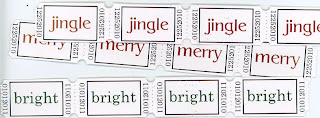
Freebie! Xmas adage tickets

I was thinking earlier today that I liked the look of adage tickets, but that they were 1) overpriced for what they are, and 2) not exactly to my taste. I wanted ones that had Christmassy messsages so I could add a quick sentiment to my last-minute holiday cards and crafting, without a fussy background, so I could match them to my cards, and cheap - always cheap. It occurred to me that I could make my own, so I did.


These are the tickets I made, and I will tell you how I did it, so you can do it too.  First, I printed them out from the image I will be giving you in a bit.  I placed them in a tight grid, 40 tickets to a sheet of cardstock.  To get perforations between the individual tickets, I ran the sheet through my sewing machine UNTHREADED - that made the little holes.  then I took a regular sized circle hole punch and punched at the intersections of the tickets to get that ticket corner look (it's fast - you do 4 corners at once!).  Then I cut it into the strips you see here.

I printed these on white, with the thought that I could burnish them with distress inks for color, or even stamp or color them (picture candy stripes!)  I could also print them on any color or type of cardstock I wished.  Tickets are one of the few things that look really good on construction paper. 

However, for this card, I thought the plain white background looked very nice:


You may recognize the reindeer from papiersalat by janna.   Everything else is scraps.  I cut the layer circles freehand; it seems to go with the reindeer.
so, would you like the tickets to print yourself?  Here they are!  Just click to enlarge and save to your computer.
If you take them, and especially if you use them, please leave a comment!  I would love to see what you do with them. 

Challenges:
2 Sisters - T'was the night...
Allsorts - last minute projects
Digis with attitude - anything with a digi

Have fun!

Juliet Arrighi

Long Card from Tidbits

Tidbits are the same thing as scraps, only it sounds nicer.


I had printed a bunch of these reindeer from papiersalat on glossy paper before I knew it was bad to color on glossy with copics - I didn't want to waste the printing, so I tried coloring them with my good old bics.  The bics give a stronger color,a nd I was able to blend them a little with my copic blender.

That's tidbit number one.


To make this long card (8.5 by 3.75 inches), I scrounged through cut bits of paper on my crafting table.  See the white punched border?  That isn't a separate piece of white paper, that is the selvage from the main background piece of scrapbooking paper.  Almost all double-sided paper that you buy by the sheet comes with a white selvage that has the barcode and and name of the paper on it.  Ususally it ends in the waste basket, but I decided to use it.  That, and the scraps layered under it, are tidbit number two.

I used a 2 inch circle punch to cut out the reindeer (Donner, I think - you'd have to ask Santa).  I didn't want to have to whip out the circle cutting tools necessary to cut the next size larger circle, so I thought I would punch three circles and offset them to make a layer.  Then I realized I didn't need three whole circles, just three crescents, and that used a lot less paper (tidbit number 3).  I think it's a more interesting look, too.

Finally, the white ruffle is a scrap of winkled gift tissue.  I couldn't decide whether to keep it to wrap another present, or toss it, and it sat in my hand just long enough to get stuck on a card.  That's my last thrifty tidbit. 

Now, for the challenges:
AIFactory - holiday
Digi Doodle - animal (yeay!  I can't believe I won last time!)
Pixie Dust - snow
Sassy Studio - non-traditional colors
Inktegrity - non-traditional colors
Paper Pretties - punches
My time to craft - reindeer
Cheerful Stamp Pad - "Twas the night before ..."

Juliet Arrighi

inchies for the holidays

One of the things that is so great about inchies is that you can make them out of what would be scraps otherwise.  When I was printing large poinsettias for the large card I made a few days ago, I had extra white space, so I filled it with tiny poinsettias to use as inchies.  Similarly, I was painting some cardstock for a different project, and I had enough left over for these snowflake inchies.
By themselves they are very simple, but they are lovely embellishments for a card.  Anywhere you might put a button or flower on a card, you could probably put an inchie.  It remains to be seen whether I will keep and use these, or swap them.  Either way I will have fun little bits to play with!


Juliet Arrighi

While watching Martha Stewart...

More Drawing Lab - Martha Stewart and Eric Ripert. Can you tell which is which?

Juliet Arrighi

More Drawing Lab

One of the assignments I'm working on right now with Drawing Lab is the one where I have to draw EVERYBODY. The lesson recommends using index cards and a pen - we are supposed to be drawing by feel, without looking to much at our subjects, and our subjects are not supposed to be posing - we are supposed to draw them as they move.

There is a coffeeshop method, where you sit in a public place and watch people eat and draw them, but I'm too lazy for that. I just turned on my tv and drew the people there. You have to be careful not to pick a show where everyone is deliberately beautiful, because then your pictures don't look like people in particular, but comic book images. I watched and drew Twilight Zone people.


One of them is Martin Landau, not that you could tell, and another I think in Mariette Hartley, but none of them look quite like those people.

Drawing old, wrinkly, bald people is fun!

Juliet Arrighi

CASEing a masterpiece

My friend and TAC demo, Chris had a workshop the other day in which we made "masterpiece" cards, which is to say, cards of such detail and quality that only the best card designers could execute them. For example, consider this card:


This was not a quick card to make.  Even with many of the pieces already cut out, it took some of the ladies over an hour to complete.  It probably doesn't how, but there is both heat and dry embossing, and the poinsettia, which is colored with Copic markers (how many demos let you use their Copic Sketch markers?) is actually three-tiered paper tole. with stickles in the center.  For most of use, this was the first time using a Martha Stewart Punch-around-the-Page set. 

I was tickled with how well the card came out, but I wondered - could I duplicate my results at home?  I didn't have the beautiful TAC poinsettia stamp, but when I saw Faith's free digi, I thought I would give it a try.

I first went wrong when I used glossy paper for my poinsettia.  The glossy helps with blending, but the finish just didn't look that great.  I didn't have the the same punches or stamps, either, and Stamping Up paper just isn't as nice as the paper TAC sells.  This card is still better than what I can design myself, though.  I might have to try this again.  If you didn't know how nice the original was, you might think this is really good!


Linkage (challenges):
Designed2Delight - digital image (freebie!)
Gingerloft - bows
Karber Christmas - Christmas + digi
Craft Your Days Away - texture
Alphabet - foliage
Tuesday Throwdown - embellishments

Juliet Arrighi

Copics

I played with my new Copic Sketch markers today.  It was interesting to see how they performed on different papers.  This image was done on laser glossy copy paper, which seemed to give me much lighter coloring that I was getting on matte cardstock.  Of course, once you have an image, you have to make a card!


Why is the sky green?  Because I don't have any blue copic markers!  the red and green do look Christmassy, I must say.  The cute image is a freebie from papiersalat.  The sentiment looks pale in the scan, but in real life, it is handwritten with a glitter pen and stands out just fine.

I suppose I need challenges:
CCEE - snowman
DigiDoodle - snow
DutchDare - Christmas/winter
Paper Romance - winter
Rainbow Lady - animals
Gingersnap Creations - snowpeople
Digital Tuesday - animals

Juliet Arrighi