Romantic Rose

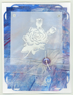
I have a ton of stamps of roses, but there is something about the rose from a springtime day (a•muse studio) it has a very vintage look to it, and I thought it would be good for a faux parchment technique card.
It has a lot of elements I haven't used in a very long time.  Eyelets are so easy to apply with the Cropadile, but I can't even remember the last time I used them.  It took me longer to find my eyelets than it did to make the whole rest of the card.  I love this corner punch, but it is so rare that I think to put fancy corners on my cardstock.  The vellum and the painted paper are leftovers from a card I did a couple of weeks ago.  Sheer ribbon, heated to make it curl, topped with a button tied with scrapper's floss - I haven't done that in a  long time, but it's still an elegant finish to a card.  There is enough room for a sentiment, should I need to add one.

Challenges:


Juliet Arrighi


Gordon Approved

I went to a technique-based card workshop this week, and one of the techniques we did involved using colorwash spray (Splash, from a•muse studio) as a watercolor medium, poured out of the bottle and into a palette, applied with a brush.  This is the card (the graininess is glitter):
After I finished it, the demonstrator who was hosting the workshop came over and told me that I did it "wrong".  Apparently, I was supposed to do it on a provided piece of watercolor paper, not directly onto the card base.  She pointed out that with the addition of water, the color would probably soak through the paper.  I opened it up and saw that there was a little bit of color coming through, but not a lot, and filed it away as a lesson learned.

When I got home, I showed it to my 24yo son Gordon, and asked him if the little bit of color on the inside was a problem, or if it just made it more "homemade".  He looked at it, and told me that he had seen me make a lot of intricate cards with layers and fancy cutting, and that he would feel insulted to get a card from me that was just 5 stripes.

Ooof!

So, I cut the front off and reworked it into the following card.
I used glitter cardstock for the umbrella, and mounted it on a blue base.  Small changes, but they make all the difference, don't they?  Gordon likes this much better.

Juliet Arrighi


Parchment Stiletto

Although the only way I would ever wear stilettos would be flat on my back, I loved the lacy look of this particular shoe (stamp is from SweetStamps), and thought it would be perfect for a faux parchment technique on vellum.
 The paper underneath the vellum is that homemade paper I made a couple of months ago by smashing azaleas into white cardstock.  It had a very muted purple color, so I tried to match it with purple cardstock, which just made the color look gray.  I figured the only thing to do is to match it with gray cardstock, so you can really see the purple.  I had to punch and doodle a couple of butterflies to match the one on the shoe.  Three brads hold the vellum to the paper - I hate trying to glue vellum!

Challenges:


Juliet Arrighi


The head of our home

I was struggling to think of a Father's Day card for my husband, when I remembered that I did have a skull stamp, in my nevermore set from a•muse studio.  It's a very gothic/Halloweenish set, but my husband rides a Harley and has tons of tshirts with skulls on it, so this is more representative of him than your usual fishing/golf motif.

The metallic background is cut from a sheet of newspaper that was under a project my husband was spray-painting - I'm sure he will recognize it.  The nevermore stamp set doesn't have wings, but it does have a raven, so I stamped the raven twice, once using a mirror image stamp, and cut the wings off the raven.  The orange accents are a Harley Davidson color .  This is the inside of the card:
It is very much my husband's style.

Challenges:

Juliet Arrighi


Cut Borders

I was at a workshop yesterday to make cards for foster children.  The hostesses of the workshop and most of the attendees were scrapbookers, which I thought was in the same general classification as stampers, but was I wrong!  These ladies were afraid of ink.  All their cards were done with punches and stickers, but not a stamp in the lot.  I brought a couple of stamp sets and a black ink pad and my tombows, and made some cards that looked very different than theirs.  I offered the use of my stamps, but they were having nothing to do with them.

One of the ladies said that she was intrigued by stamping but didn't want to have to by all the stuff, which seemed a funny thing to say, considering there were hundreds of dollars of stickers on the table, and when you use them once, they are gone.  Anyway, I do know that I spend a lot on stamping stuff, but really, I don't need to.  Even a simple stamped card can be satisfying.  Case in point:
This is plain white cardstock, black ink, and some markers and scissor work. The butterfly stamp and sentiment are in the snail&co stamp set from a•muse studio. The Cut Borders Technique uses masking to create a continuous edge of stamping.  The most expensive part of this card is the Technique Junkies newsletter subscription, which is where I learn to do stuff like this.

Challenges:
Juliet Arrighi